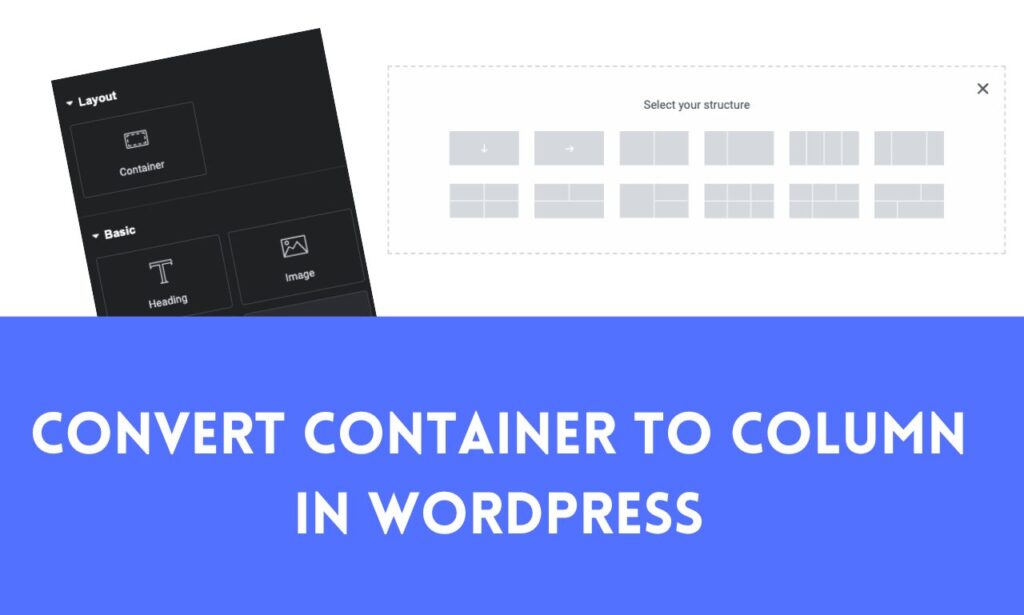
Are you looking to change the layout and presentation of your WordPress site? Switching from container-based designs to column-based layouts can be an essential step towards achieving more organized and visually appealing websites!
In this guide, we will walk you through the process of how to convert from container to column WordPress. Whether you are a beginner or an experienced WordPress user, this tutorial will provide you with all the knowledge and tools you need to smoothly make this transition, improving both the aesthetics and functionality of your site.
Converting from Container to Column in WordPress
Converting containers to columns in WordPress requires editing your site’s content layout or structure. WordPress offers tools to easily create columns via themes and page builders, so you can adjust content as necessary. Note that you face difficulty converting containers to columns in WordPress if you don’t have any prior coding knowledge or WordPress page builder; my suggestion would be to hire a WordPress developer like me.
Hiring a WordPress developer can save you time and frustration. With their expertise, they can quickly and efficiently convert containers to columns in WordPress, ensuring your website looks professional and functions seamlessly. Additionally, a WordPress developer can provide personalized guidance and support, helping you navigate any challenges that may arise during the process.
To make the switch successfully in WordPress, follow these general steps.
1. Access the WordPress Editor:
- Log in to your WordPress dashboard.
- Navigate to the page or post where you want to make the conversion.

2. Edit the Content:
- Locate the container or section you would like to turn into columns.
- Depending on your WordPress setup, this could include something such as theme-level layout options, page builder plugins (e.g. Elementor or Divi), custom HTML/CSS, or custom coded solutions.

3. Use a Page Builder (if applicable):
- Editing columns should be easy if your website using Elementor or Divi as its page builder, making editing quick and painless.
- Find the section or widget you want to convert into columns and look for options related to columns, rows, or layouts.
- Add new columns, adjust their widths, and move content accordingly.
4. Customize the Layout (if not using a page builder):
- If you are not using a page builder, you might need to work with custom HTML and CSS to create columns.
- You can use HTML
<div>elements for column containers and apply CSS styles to control their appearance and layout.
Here’s a basic example: HTML
<div class=”column”>
<!– Content for the first column goes here –>
</div>
<div class=”column”>
<!– Content for the second column goes here –>
</div>
</div>
You’ll need to add CSS rules for .column-container and .column to style them as columns.
For example: CSS
.column-container {
display: flex;
justify-content: space-between;
}
.column {
flex: 1;
margin: 0 10px; /* Adjust margins as needed */
}
5. Save or Update Your Page:
- After making the necessary changes, save or update your page or post.
6. Preview and Adjust:
- Preview your changes to ensure the columns display as expected.
- Make any additional adjustments as needed until you achieve the desired layout.
7. Publish or Update:
- Once you’re satisfied with the column layout, publish your changes or update the page.
Keep in mind that the exact steps and options may depend on your WordPress theme and the plugins you’re using, so if you experience difficulties or have specific queries regarding setup, referring to either your theme’s documentation or that for your chosen page builder may provide more in-depth instructions. Or hire any WordPress developer like me.
Understanding Containers and Columns in WordPress
In WordPress, containers and columns are structural elements that help you organize and layout content on a web page. They are used to create visually appealing and structured web pages without requiring you to write custom HTML or CSS code. Typically, these elements are used within the WordPress block editor (Gutenberg) or with page builder plugins such as Elementor, Beaver Builder, or WPBakery Page Builder.
1. Containers:
Containers are designed to wrap around one or more content blocks, providing a designated space for content. They are often used to group related content together and define the overall layout of a section or page.
Containers can have various options for setting background colors or images, padding, margins, and other styling properties. In WordPress, common container types include the “Group” block in Gutenberg or “Section” elements in page builders.
2. Columns:
Dividing a container into multiple vertical sections is made possible by using columns. This allows you to create a grid-like layout for your content. Each column can have different types of content blocks such as text, images, videos, or widgets.
This feature is especially helpful in creating responsive designs, as columns can adjust the layout automatically based on the screen size or device, making your website look great on both desktop and mobile devices. Many page builders offer options for adjusting the width, spacing, and alignment of columns, giving you more control over the overall design of your website.
Here’s how you can work with containers and columns in WordPress:
Using Gutenberg (Block Editor):
When using the WordPress block editor, you have the option to use the “Group” block, which essentially acts as a container. By adding this block to your page, you can add other blocks, including columns, within it. If you want to include columns in your content, simply use the “Columns” block. You can choose the number of columns you want and then add your desired content blocks to each column.
Using Page Builder Plugins:
If you are using a page builder such as Elementor or WPBakery Page Builder, you will find dedicated elements for creating containers and columns. To begin with, you can add a section (container) and then add columns within that section. Each column can contain various content elements. These page builder plugins offer a more visual and drag-and-drop approach to designing your pages, making it easy to create complex layouts.
Evaluating the Need for Column Layouts:
Advantages of Columns:
Improved Readability:
1. Reducing Line Length:
- Columns divide the content into narrower sections, limiting the number of characters on each line of text. Shorter lines are easier for readers to follow without losing their place or getting overwhelmed.
- When text spans across the entire width of a webpage (especially on large screens), lines can become excessively long, making it challenging to read efficiently.
2. Avoiding the “Wall of Text”:
- Without columns, text can appear as a daunting wall of continuous content. This can be intimidating and discouraging for readers, especially those who are quickly scanning for information.
- Columns break up the content into smaller, digestible chunks, making it easier for readers to navigate through the text and find what they’re looking for.
3. Improved Comprehension:
- Shorter line lengths improve comprehension as readers can focus better on each individual line of text. This is especially important for complex or technical content.
- Readers are less likely to lose their place or skip lines when reading in columns, resulting in a more thorough understanding of the content.
4. Enhancing Aesthetic Appeal:
- Columns also contribute to the visual appeal of a webpage. A well-structured layout with appropriately sized columns looks more organized and inviting.
- Aesthetic appeal can engage readers and encourage them to spend more time on your website.
5. Responsive Design:
- Columns can adapt to different screen sizes, ensuring that the reading experience remains comfortable whether the visitor is using a desktop computer, tablet, or mobile device.
- Responsive design is essential in today’s multi-device landscape to accommodate users across various platforms.
The Importance of Comfortable Reading Experiences for Website Visitors:
A comfortable reading experience is vital for several reasons:
Engagement: Visitors are more likely to engage with your content when it’s easy to read and visually appealing. This can lead to longer visit durations and increased interaction with your website.
Retention: Readers are more likely to remember and retain information from content that they find comfortable to read. This is particularly important for educational or informational websites.
Accessibility: Improved readability benefits all visitors, including those with visual impairments. Using columns and optimizing text layout can make your website more accessible to a broader audience.
User Satisfaction: A comfortable reading experience contributes to overall user satisfaction. Satisfied visitors are more likely to return to your site and recommend it to others.
In conclusion, columns enhance text readability by reducing line length, resulting in a more pleasant reading experience for website visitors. Prioritizing readability not only benefits your audience but also helps achieve your website’s goals, whether it’s conveying information, promoting products, or sharing ideas effectively.
Enhanced Visual Appeal:
Columns can significantly enhance the visual appeal of your website’s content and make it more engaging to visitors. Here are some ways in which columns contribute to a visually appealing and creative design:
1. Structured Layout:
- Columns provide a structured framework for organizing content. This structure helps create a clean and organized appearance, which is visually pleasing to users.
- When content is neatly divided into columns, it conveys a sense of order and professionalism, making the page look more polished.
2. Improved Hierarchy:
- Columns allow you to establish a clear hierarchy within your content. You can use different column widths and arrangements to emphasize certain elements, such as headings or images.
- This hierarchy guides users through the content, highlighting what’s most important and drawing their attention where it matters.
3. Visual Contrast:
- Columns enable you to create visual contrast between different sections of your content. For instance, you can use alternating background colors or textures in columns to make each section distinct.
- Visual contrast makes the content more engaging by breaking up monotony and adding visual interest.
4. Better Use of Space:
- Columns can help you make efficient use of available screen space. Whether it’s a wide desktop monitor or a narrow mobile screen, columns can adapt to different screen sizes and orientations.
- This adaptability ensures that your content looks well-organized and visually appealing across a variety of devices.
5. Creative Design Possibilities:
- Columns offer creative design possibilities that go beyond simple text layout. You can incorporate images, videos, icons, and other media within columns to create visually rich content.
- Elements within columns can be aligned, spaced, and styled to achieve unique and eye-catching designs.
6. Emphasis on Multimedia:
- Columns can be used to showcase multimedia content, such as image galleries, embedded videos, or interactive elements. These visual enhancements can capture users’ attention and keep them engaged.
7. Branding and Identity:
- Columns can be styled to match your website’s branding and visual identity. Consistent use of colors, fonts, and spacing within columns reinforces your brand’s image and professionalism.
8. Scannability:
- Columns make it easier for users to scan content quickly. This is especially important in today’s fast-paced online environment where users often skim through pages.
- By breaking content into smaller, manageable sections, columns help users find the information they’re looking for more efficiently.
Content Organization:
Columns are a valuable tool for organizing content logically on a web page. They enable you to create a structured layout that presents information in a clear and organized manner. Here are some examples of how columns can be used for content organization:
1. Categorizing Information:
Columns can be used to categorize and group related information together. For example, on a product listing page, you can use columns to separate products into categories, with each column representing a different product category.
In a blog or news website, columns can be dedicated to different topics or sections, making it easy for readers to find content that interests them.
2. Side-by-Side Comparisons:
Columns are ideal for side-by-side comparisons. For instance, in an e-commerce website, you can use columns to display product specifications, allowing users to compare features of different products conveniently.
In a financial news site, you can use columns to display stock prices or market data for different companies, making it easy for investors to compare and analyze data.
3. Steps and Processes:
Columns can be used to present step-by-step processes or instructions. Each column can represent a different step or stage of a process.
For example, a cooking website can use columns to display a recipe, with each column containing instructions for a specific part of the cooking process, such as preparation, cooking, and serving.
4. Content Types:
Columns can be used to differentiate between different types of content. For example, a magazine-style website can use columns to separate articles, images, and video content, allowing visitors to explore content based on their preferences.
A portfolio website can use columns to showcase various types of work, such as photography, web design, and graphic design.
5. Lists and Grids:
Columns can be employed to create organized lists or grids. For instance, an events website can use columns to display upcoming events with details like date, time, location, and ticket prices.
A directory website can use columns to present listings of businesses or services, with each column representing a different category or subcategory.
6. Multilingual Content:
In multilingual websites, columns can be used to display content in different languages side by side, making it easier for users to switch between languages and compare translations.
7. FAQ Sections:
Columns are often used for FAQ (Frequently Asked Questions) sections. Each column can represent a different question and its corresponding answer, providing a structured and easily navigable FAQ page.
8. Content Variety:
Columns can be employed to add variety to content presentation. For example, a news website can use columns to display articles with different formats, such as text, video, and interactive graphics, offering a rich and engaging reading experience.
Disadvantages of Containers:
Complexity for Beginners: For individuals who are new to web development or content management systems like WordPress, working with containers can be initially confusing. Understanding how to use containers effectively, adjust their settings, and manage their layout can be a learning curve.
Overuse and Clutter: It’s possible to overuse containers, leading to cluttered and confusing web page layouts. When there are too many containers and columns, it can be overwhelming for visitors, making it harder for them to find the information they need.
Responsiveness Challenges: While containers and columns can help with responsive design, they may also pose challenges. Poorly designed containers might not adapt well to different screen sizes, causing content to become distorted or hard to read on certain devices.
Increased Page Loading Times: Complex layouts with multiple containers, columns, and content elements can lead to increased page loading times. This can negatively affect user experience, particularly on slower internet connections or mobile devices.
Accessibility Concerns: Containers, if not used correctly, can create accessibility issues. Poorly structured content within containers might not be navigable for screen readers, causing difficulties for users with disabilities.
Design Limitations: Containers and columns are generally designed to work within the constraints of the website’s theme or template. This can limit the degree of customization and creativity in designing unique page layouts.
Plugin and Theme Compatibility: Depending on the plugins and themes you use with WordPress, there may be compatibility issues when working with containers. Some themes and plugins may not fully support the container and column structures.
Maintenance Challenges: Maintaining a website with numerous containers and columns can become complex over time. If you decide to reorganize or update your content, you may need to make changes to multiple containers, which can be time-consuming.
Content Responsiveness: Content within containers and columns must be carefully managed for responsiveness. If not properly configured, images and text may not resize or adjust to different screen sizes, leading to a less-than-optimal user experience.
Mobile Considerations: While containers can be responsive, mobile optimization requires additional attention. Designing for mobile may involve adjusting the layout and content hierarchy within containers to ensure an optimal experience on small screens.

